7 Web Design Mistakes That Everyone Needs To Avoid
We all believe that content is the king, but forget that the king can’t make it all lone. Several other factors pump up your SEO, and that’s why you need to be aware of everything equally. A digital marketing company in Ahmedabad states that website design is one of the most overlooked factors.
Will you like reading your favorite book in the scorching hot temperature when there’s something less attractive is available at a much more comfortable place? Well, interests matter. But, until and unless there is some significant need of info shared by you, users will never stay on your page if it’s not user-friendly.
User experience is a big concern for every SEO specialist. Visitors will only subscribe and come back if you can make it to their comfort level. So, most of the marketers overlook the concept of web design, and that’s where traffic starts draining.
Here are seven poor web design mistakes that everyone needs to avoid for better SEO results.
Website Navigation Isn’t Smooth
[Image Courtesy:subiz.com]
Do you think that a good looking website is all that you need? If yes, you are surely on the wrong track. The site is about visuals, but it’s more about functionality. If your website looks good, has the best images, quality content, but doesn’t perform well, you need to work on it.
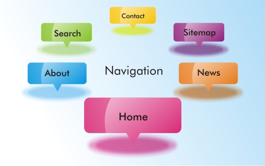
When you use the navigation tools like menus and search bars, users tend to go away from the doorstep only. And that will eventually come into the knowledge of search engines making your website ranking go lower.
You Don’t Know How To Use Heading Tags
[Image Courtesy:httpzone1.aqusagtechnologi.netdna]
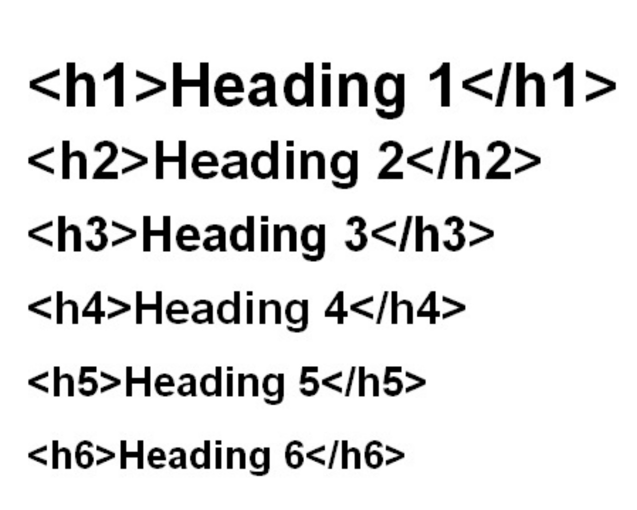
Heading text is as you can understand header text, which is an HTML code. Such codes are different for various headers. Each header is used to present some particular type of content. For example, H1 is the biggest and is usually used to write the title of the next. The next size would be used for subtitles and so on.
The mistakes you might be doing include, using H1 tags more than once, putting the whole paragraph in header text, and using header text for styling purpose.
Smartly using these functions will make your SEO initiative better, but if you use them unknowingly, you will end up with a complete mess.
You Serve Pop-ups More Than Content
[Image Courtesy:cryodragon.ca]
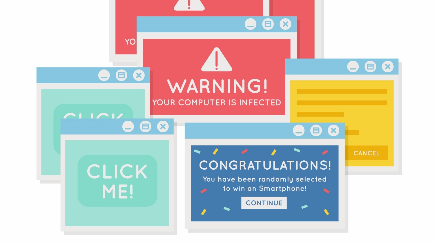
Using popups is nowhere wrong, but you need to keep it moderate. Too many popups lead to a lack of interest, and you will find visitors leaving your page too early. Google will receive negative signals, and you know the results.
You might also face penalties for providing such a horrible user experience.
Search engines try to make the platform smoother for users, and if your popups compromise over that, you will not be spared.
Not Using Alt Text In Images
[Image Courtesy:rnib.org.uk]
Putting text in images isn’t something new. But what you don’t know is that Google can’t navigate pictures, and thus, your efforts will be wasted as it will not be a part of your SEO practice.
Use alt text when presenting content in the form of images, you make its way to Google crawlers, which eventually improves your SEO efforts.
The Never-ending Pages
[Image Courtesy:httpimg00.deviantart.net]
Infinite scroll is the worst thing to offer when someone visits your website. They are trying to find the end of the page to see some contact info, and the page is not ready to end.
Adopting such layout will be beneficial in the case of blogs so that users can read the whole blog in one go. But don’t make it more than that.
Your Media Files Are Too Large
[Image Courtesy:facebook.com]
When asked about the most common website design issue that affects social media marketing in Ahmedabad, the SEO specialist called it on too large media files.
When the size of audio, video, and image content on a website isn’t compressed, it makes the page heavier, and that takes more time to load. The speed slows down, and your ranking as well.
You Don’t Know How To Customize Your 404 Pages properly
[Image Courtesy:httpi2.wp.com]
When a page is not found, the 404 page appears and tells the users that some issue has occurred. Now, if you don’t know how to customize and communicate through this page, you are definitely putting a hole in your traffic bucket. Make sure either it leads to the right page or at least informs the users in a better way.


